Interview with Kit Frick: Debut Novelist, Poet & Word Genius

kitfrickportrait34_credit-carly-gaebe-steadfast-studio.jpg

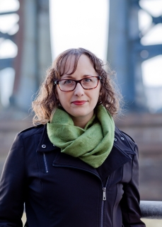
Kit Frick is a novelist, poet, and MacDowell Colony fellow. Originally from Pittsburgh, PA, she studied creative writing at Sarah Lawrence College and received her MFA from Syracuse University. When she isn’t putting complicated characters in impossible situations, Kit edits poetry and literary fiction for a small press, edits for private clients, and mentors emerging writers through Pitch Wars. Her debut young adult novel is See All the Stars (Simon & Schuster / Margaret K. McElderry Books, August 14, 2018), and her debut full-length poetry collection is A Small Rising Up in the Lungs (New American Press, September 4, 2018).

Hi, Kit! I’m so glad you agreed to do this interview!

So **cracks knuckles** let’s get this started!

Intense and volatile female friendships are a major theme in your book. What inspired this? Also, what are some of your favorite books (or other media)that explore this topic?

See All the Stars_Kit Frick

KIT: It’s been my experience—and the experience of many women in my life—that friendships between women in adolescence and early adulthood are rarely simple. They’re intense—intensely good, intensely close, intensely consuming, intensely critical,intensely imbued with meaning, intensely fraught with the trappings of personal identity formation and navigating an often unforgiving social world.

The friendships between Ellory and Ret (and among Ellory and Ret and their other friends) in See All the Stars are by no means autobiographical, but those character relationships do feel very personal to me, as the nuances of the friendships that populated my high school and young adult years are still so vivid, even today. I think this is the case for many women—current teens and young adults and fully-adult-adults. We feel those friendships deeply. They’re heightened in both our experience and our memory.

There are so many rich, nuanced fictional representations of friendships among teen girls in books and other media. A few YA novels that really get at the heart of things are Always Forever Maybe by Anica Mrose Rissi, Underneath Everything by Marcy Beller Paul, and A Line in the Dark by Malinda Lo. One adult novel that absolutely knocked my socks off for its portrayal of a volatile teen girl friendship is Girls on Fire by Robin Wasserman. On television, an evergreen favorite (of yours and mine!) is My So-Called Life, and more recently I’ve loved Pretty Little Liars for its heightened—and at times hyperbolic—yet still identifiable portrayal of a friend group with high highs and very low lows.

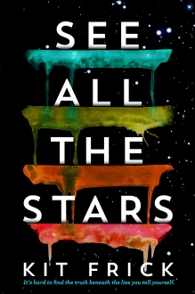
SEE ALL THE STARS is set in Harrisburg, Pennsylvania, and having lived near there myself, I really appreciated all the regional details that you included! For you, to what extent does setting influence storytelling?

KIT: I’m so thrilled you connected with the central Pennsylvania setting! I find setting to be extremely important as a writer; writing setting is almost like writing another character. For See All the Stars, I chose a setting that was “teenage-adjacent” for me; in other words, I grew up in Pittsburgh, which is in southwestern PA, and I wanted to be able to tap into that Pennsylvania landscape for my debut without tying myself too closely to the “reality” of my own adolescent stomping grounds.

So far, I’ve chosen settings with which I have a personal connection for all my projects. My second book is set primarily in West Virginia, in a fictional region of the panhandle modeled closely after Fayette County, PA, which is geographically very nearby despite being in a different state, and there are also a few scenes in Pittsburgh! My work-in-progress is set in New York City, where I live now, and south Florida, where I’ve spent

quite a bit of time visiting family. I’ve stayed close to my personal experience in all these books so that I can bring in the details that will bring the setting vividly to life on the page, and also so I can allow the setting to have its influence on the characters and how they move through the world.

Ah, very exciting to hear about these new settings! I’m super fascinated by Florida, which I’ve found to be such a fascinating mix of urban and depressed spaces within some amazing natural beauty.

Okay, next question…

I was really struck by how beautifully written your book was, so I was delighted to discover that you also have a book of poetry scheduled to come out this fall. Do you find that there are synergies for you writing in these two literary forms? Do you see yourself ever writing a YA novel in verse?

KIT: Thank you so much! And yes, my first book of poetry, A Small Rising Up in the Lungs, releases this fall from New American Press, which is very exciting.

I developed an ear for diction and tone through studying poetry—both through reading and writing. In some ways, the two forms require very different compartments of my writer’s “toolbox.” When I’m plotting and structuring a novel, I’m using my creative brain in a very different way than when I’m drafting a poem. But when it comes to sentence-level concerns (how a sentence sounds, how it works with the sentences that precede and follow, how the choice of a specific verb or modifier can work to create mood or suggest a specific understanding) that’s where my brain is tapping into my poetic background.

And I love YA novels in verse! I recently got my hands on an advanced copy of Juleah del Rosario’s 500 Words or Less, which is coming out in September from Simon Pulse, and it’s sooooooo good! Whether or not I will attempt to “combine forces” and write my own novel in verse remains to be seen, but I can’t say I’ve never thought about it!

The road to being published is a long and complicated one for many writers. Now that you’re on the verge of your novel being launched, what have been some of your favorite moments in your debut journey?

KIT: There have been a lot of amazing moments along the way. Most days I’m still
pinching myself. It’s a classic answer, but receiving that offer of representation from my agent, Erin Harris, was the first amazing milestone moment. I was at work, at my former job at NYU, and I almost started crying at my desk. Then receiving the offer of publication from my editor, Ruta Rimas at McElderry, a few months later was surreal. For that one, I was at a writing residency at the MacDowell Colony, without any cell service and very limited internet, so just connecting with my agent and future publisher about the offer was a kind of epic feat. From there, the day the initial cover design landed in my inbox, the day the book went up for pre-order, connecting with all the amazing authors in my debut group—like you!—and attending launch parties for fellow debuts, learning the book would be sold in-store in Target, receiving those first excited emails from readers … It’s been an amazing whirlwind.

Last—but not least!—can you tell me anything about your next project?

KIT: My next book is a YA thriller about two girls under unbearable pressure from their families and communities—and what happens when they decide to stop compromising. I just reviewed my copyedits and got them turned in, which means the manuscript is being typeset now, which is very exciting. It’s scheduled to come out in summer 2019, also from Simon & Schuster/McElderry Books, and I’ll be able to share a lot more about it later this year!

Thanks so much, that sounds utterly tantalizing!

Want to learn more about Kit? Go to her website or follow her on social media at:

Twitter    Instagram   Pinterest   Facebook

Want to go ahead and order a copy of SEE ALL THE STARS? Here are a bunch of options:

Interview with Regina Flath, Book Cover Designer Extraordinaire

ReginaFlathCovers_1.jpg

Sometimes you get lucky. Like when you include an incredible book cover, SUICIDE NOTES FROM BEAUTIFUL GIRLS, as an example of the aesthetic you’d love for your book and then a few weeks later your editor tells you that book’s designer, Regina Flath, will be working on your cover.

So who is Regina Flath? She’s an award winning book designer and illustrator, with a BFA from the University of the Arts, and she is currently a Senior Designer at Random House Children’s. She’s also the-host of Which Witch is Witch, a podcast about witches in pop culture. Covers of hers that you may recognize include, among many others, THIS MORTAL COIL, DIARY OF A HAUNTING, WHEN DIMPLE MET RISHI, and AFTERWORLDS.

And, fortunately enough for me, she’s agreed to answer some questions about her work, including how she approaches her design work, some of her favorite recent covers by other designers featuring protagonists of color, and who she’d want on her (hypothetical) heist team.

ReginaFlathCovers_2.jpg

What impresses me the most about your work, is that not only are your covers stunning, they are in many cases wildly different from one another. How do you approach cover design for an individual title, and how do you keep expanding your design horizons?

Thank you! Each book is it’s own little world; when I get assigned a title, I try to dive in as much as possible, reading the early manuscript if it’s available, or the detailed synopsis. From there, how I approach concept differs depending on the genre and specific needs of the book. I may write out notes to myself as a read the manuscript for ideas of imagery or themes, I may jump right into looking at stock imagery, or I might sketch several thumbnails in sharpie to hash out an idea that would be executed by an artist or photographer or typographer. As far as expanding horizons, I’m always on the lookout for inspiration. It might be a movie I see or a subway poster or a random tumblr meme. My husband is also an artist who has vastly different tastes than I do, so I often find myself inspired by whatever art he’s looking at, since it’s usually not something that would be on my radar at all.

Recently you learned that someone literally got a tattoo of your cover art from the book WE ARE THE ANTS. Have there been other notable highwater marks in terms of fan or author reactions to your covers?

Probably the most moving fan reactions have been to WHEN DIMPLE MET RISHI. I got several emails from fans saying how important it was to them to see themselves on a cover and that really made me feel like I had made a difference. That said, author reactions always make my day. Once I had an author write to me that his cover was so exciting for him because it visually communicated a theme in the book that he hadn’t considered as a possible cover direction and we got to have a whole dialogue about the themes in the book. That made my overachieving, AP English teen self immensely happy!

In addition to designing covers, you’ve illustrated multiple children’s books. Which came first for you, illustration or design?

Definitely illustration. My degree is in illustration and for a while I planned to be a full time freelance children’s book illustrator. Once I realized I would lose my mind if I worked mostly by myself, I changed my plan to in-house design. I started designing picture books and middlegrade but YA quickly became my passion and I’ve been doing YA exclusively for over 5 years.

If you could design the cover for a special anniversary edition of your favorite book from childhood, which book would you choose and why?

Absolutely THE SECRET GARDEN. I have a British edition given to me by an aunt when I was 8 or 9 and I remember distinctly it was that hard bound, rough front, ribboned, and illustrated with color tip-ins book that made me decide I HAD to work on books for my profession. I still have my copy.

Your website bio mentions that you’re a friend to imaginary creatures everywhere, but let’s get specific. Which imaginary creature is your daemon/patronus and which one would you invite to your party only because its mom made you?

Well Buzzfeed just confirmed for me that my patronus is Manananggal, the Filipina vampire-like witch creature that feeds on blood and can separate her torso from her body and fly. As you do. The creature likely to end up at my party because MY mom made me invite it would likely the nuno sa punso. Growing up it was very important to establish good relationships with the nunos because otherwise they’d curse you.

You’ve designed a number of incredible covers for YA thrillers. The cover of my book, THE WINDOW, manages to be very striking, and also more than a little unnerving, without being at all violent or graphic. Did the concept and visuals for it evolve as you worked on it, or did you have this vision for it right from the start?

When I read THE WINDOW, it was a very early draft and I had a COMPLETELY different idea of how the book would end (lots of twists and turns in the story!) so I wanted to be sure whatever I had happening in the imagery wouldn’t give anything away. I knew I wanted to use window imagery and I knew I wanted to nest the window into the title and I didn’t want to show 2 girls. In my head it was important that the viewer didn’t know who was looking out the window. I did a lot of research to find the image that worked well for my vision and for the tone of the book. Initially, I had different windows and things happening with shadows and much more fleshed out imagery but as I played with the design I realized that a more spare approach would be more unsettling. So while I knew from the beginning the concept for the window in the title, the imagery changed as I worked quite a bit.

You have a short deadline and you have to power up. What snacks do you procur for during, and what is your celebration meal afterwards?

I’d definitely have smartfood popcorn and beef jerky; I’m a savory snack kind of girl. And cans of plain seltzer, lol! Celebration meal would be duck breast, mashed potatoes, and garlic green beans. And tiramisu for dessert!!

YA publishing is starting to try to move away from being so heavily weighted towards pasty people writing about other pasty people, and there have been some incredible covers over the last year or two featuring models/illustrations of protagonists of color. Do you have any personal favorites, and also any specific hopes for how representation will expand in publishing and cover design?

Yes! I love being a part of the movement toward more diversity on covers. As a mixed Filipina/American (or hapa), it’s been important to me morally as well as personally to make sure that diversity is represented well on covers. My current favorites are definitely DREAD NATION, THE HATE U GIVE (such clever type lock up as well!), and my top favorite right now is TYLER JOHNSON WAS HERE. It’s so beautiful and I’ve been trying to do the pattern-over-figure thing in a design for YEARS. I’m so jealous (in a good way) with how that cover was executed!

Your picture book debut was illustrating a book called EMILY GRACE AND THE WHAT-IFS: A STORY FOR CHILDREN ABOUT NIGHTTIME FEARS. What is the first and last movie or book that gave you nightmares, and what common source of fear leaves you “meh”?

First nightmare books were definitely RL Stine, though I continued to read them constantly. I actually designed several bind ups for RL Stine and that was one of my career highlights. Last nightmare movie was Quarantine. There’s a weird attic scene that messed me up for weeks!! In general, most common fears are meh to me but I get freaked by a jump scare every time. Also, I spend a lot of my life seeking out ways to face my fears. For instance, I’m terrified of falling, which is how I started doing aerial arts like lyra and silks. Rolls, drops, and tricks that require all my body weight on one arm, leg, or whatever are still scary but I do them often enough that I’ve gotten comfortable in the fear place. I find it helps me to be less panicked when I’m scared because I’m just so used to being uncomfortable in that way.

Last, but not least, Ocean’s 8 is coming out soon. Who would be on your heist team, and what role would you yourself play?

That’s a BIG question and depends a lot on what we’re heisting. But if we narrow the scope to casting from my officemates, I would say Alison, our art director, is definitely the mastermind. Ray, the other senior designer is the hacker/gadget guy (he’s always optimizing our systems at work, lol). Angela, the associate art director would be the femme fatale/distraction. And I would probably be the roper or the conman since I tend to have the most success talking editors into my crazier ideas, ha!

Thanks, Regina! This was a lot of fun!